Bloggerテンプレート自作 #22:カスタム人気記事ガジェットを作る

前回の「カスタムアーカイブを作る」に引き続き、今回は「カスタム人気記事ガジェットを作る」を実践してみようと思う。
人気記事ガジェットはBloggerの標準ガジェットなのだが、実はこれは条件分岐さえしっかりしていれば丸々自作できてしまう。なので、今回は人気記事ガジェットを自作する方法をまとめていくことにする。
人気記事ガジェットについて
基本構造
<!-- カスタム人気記事 -->
<b:widget id='PopularPosts1' locked='false' title='カスタム人気記事' type='PopularPosts' version='1' visible='true'>
<b:includable id='main'>
<!-- ガジェットタイトル -->
<b:if cond='data:title'>
<h3>
<data:title />
</h3>
</b:if>
<!-- カスタム人気記事はじめ -->
<div class='popular-post widget-content custom-pp'>
<ul>
<b:loop values='data:posts' var='post'>
<li>
<b:if cond='data:showThumbnails == "false"'>
<b:if cond='data:showSnippets == "false"'>
<!-- タイトルのみの場合 -->
<b:else />
<!-- タイトル+抜粋の場合 -->
</b:if>
<b:else />
<b:if cond='data:showSnippets == "false"'>
<!-- タイトル+サムネイルの場合 -->
<!-- サムネイル有 -->
<b:if cond='data:post.thumbnail'>
<!-- サムネイル無 -->
<b:else />
</b:if>
<b:else />
<!-- タイトル+サムネイル+抜粋の場合 -->
<a expr:href='data:post.href'>
<!-- サムネイル有 -->
<b:if cond='data:post.thumbnail'>
<!-- サムネイル無 -->
<b:else />
</b:if>
</b:if>
</b:if>
</li>
</b:loop>
</ul>
</div>
</b:includable>
</b:widget>
上記が人気記事の骨組みとなるコード。
コメントの<!-- ~の場合 -->以下に好きなコードを書いていけば理想の人気記事ガジェットを作ることができる。
作業工程
HTMLを作る
<!-- カスタム人気記事 -->
<b:widget id='PopularPosts1' locked='false' title='カスタム人気記事' type='PopularPosts' version='1' visible='true'>
<b:includable id='main'>
<b:if cond='data:title'>
<h3>
<data:title />
</h3>
</b:if>
<div class='popular-post widget-content custom-pp'>
<ul>
<b:loop values='data:posts' var='post'>
<li>
<b:if cond='data:showThumbnails == "false"'>
<b:if cond='data:showSnippets == "false"'>
<!-- タイトルのみ -->
<a expr:href='data:post.href'>
<div class="pp-items-title">
<div class="pp-title-only">
<data:post.title />
</div>
</div>
</a>
<b:else />
<!-- タイトル+抜粋 -->
<a expr:href='data:post.href'>
<div class="pp-items">
<div class="pp-info">
<div class="pp-title">
<data:post.title />
</div>
<div class='pp-snippet'>
<b:eval
expr='data:post.snippet snippet {length: 60, links: false, linebreaks: false, ellipsis: true}' />
</div>
</div>
</div>
</a>
</b:if>
<b:else />
<b:if cond='data:showSnippets == "false"'>
<!-- タイトル+サムネイル -->
<a expr:href='data:post.href'>
<div class="pp-items">
<div class='pp-thumb'>
<!-- サムネイル有 -->
<b:if cond='data:post.thumbnail'>
<img expr:src='resizeImage(data:post.thumbnail,320)' />
<!-- サムネイル無 -->
<b:else />
<img
src="代替サムネイルのURL" />
</b:if>
</div>
<div class="pp-info">
<div class="pp-title">
<data:post.title />
</div>
</div>
</div>
</a>
<b:else />
<!-- タイトル+サムネイル+抜粋 -->
<a expr:href='data:post.href'>
<div class="pp-items">
<div class='pp-thumb'>
<!-- サムネイル有 -->
<b:if cond='data:post.thumbnail'>
<img expr:src='resizeImage(data:post.thumbnail,320)' />
<!-- サムネイル無 -->
<b:else />
<img
src="代替サムネイルのURL" />
</b:if>
</div>
<div class="pp-info">
<div class="pp-title">
<data:post.title />
</div>
<div class='pp-snippet'>
<b:eval
expr='data:post.snippet snippet {length: 60, links: false, linebreaks: false, ellipsis: true}' />
</div>
</div>
</div>
</a>
</b:if>
</b:if>
</li>
</b:loop>
</ul>
</div>
</b:includable>
</b:widget>
上記が当テンプレートに実装したカスタム人気記事のコードとなる。
代替サムネイル、要約分の長さのコントロールができるようになっているのが特徴。
CSSを作る

/* 人気の投稿(カスタム)
---------------------------------------------------------------------------- */
/* タイトルのみ */
.pp-title-only {
font-size: 14px;
}
.pp-title-only::before {
font-family: "Font Awesome 5 Free";
content: "\f521";
font-size: 14px;
font-weight: 900;
margin-left: 2px;
margin-right: 8px;
}
/* 共通 */
.custom-pp li {
border-bottom: solid 1px #ddd;
}
.custom-pp li:last-child {
border: none;
}
.custom-pp a {
display: block;
color: #444;
}
.pp-title {
font-size: 15px;
font-weight: bold;
}
.pp-snippet {
font-size: 13px;
margin-top:10px;
}
.pp-items {
display: flex;
}
.pp-thumb img {
width: 100px;
height: 100px;
border: solid 1px #ddd;
margin-right:10px;
object-fit: cover;
}
/* レスポンシブ(タブレット縦) */
@media screen and (max-width: 960px) {
.pp-items {
flex-direction: column;
}
.pp-thumb img {
width: 100%;
height: auto;
margin-right: 0;
margin-bottom: 10px;
}
.pp-title {
text-align: center;
}
}
/* レスポンシブ(タブレット縦) */
@media screen and (max-width: 560px) {
.pp-items {
flex-direction: row;
}
.pp-thumb img {
width: 100px;
height: 100px;
margin-right: 10px;
margin-bottom: 0;
}
.pp-title {
text-align: left;
}
}
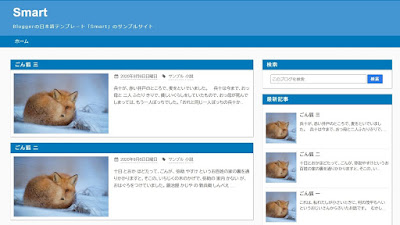
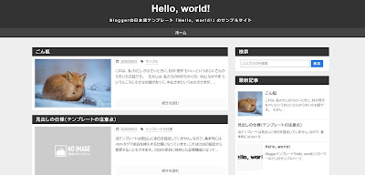
上記がカスタム人気記事を構成するCSSで画像のようなデザインになる。
レスポンシブで画像の並びが変わるようになる設定にもなっている。
スポンサーリンク
スポンサーリンク
コメント
0 件のコメント :
コメントを投稿